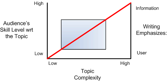
Ooooh, look, I have an idea about Technical Writing in graph form. This looks like those economics graphics that explain a behavior, not the science graphs that have an independent and dependent variable. (click the graph to see it un-resized)
Here are my ideas -
2. The further you are from the red line, the harder it is for documentation to add any value to the knowledge transfer. (Above the line, and the user ignores the docs, below the line and the docs can’t respond to the user’s needs)
As far as the technical writer is concerned:
3. The less complex a topic, the more user hand-holding is required. Your writing has to really be attentive to the user's needs to get him/her up to speed.
At some point in the middle of the red line, the user transitions from a beginner to an intermediate or advanced user. This transition signifies when you as the writer can place more emphasis on the topic, and less emphasis on metaphor and explanations.
4. The Blue Box represents the technical writing sweet spot. I define the sweet spot as the point on the graph where
- The tech writer can provide the most value to the knowledge transfer.
- The tech writer experiences the greatest challenge (and hopefully reward) for his or her work.
When you are outside of this box, you are either creating ultra-boring documentation or high-level documentation that’s probably best left for an expert to write and an editor to tighten.
Thoughts, comments?


0 comments:
Post a Comment